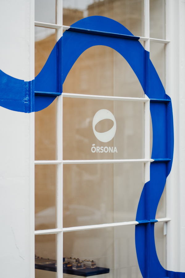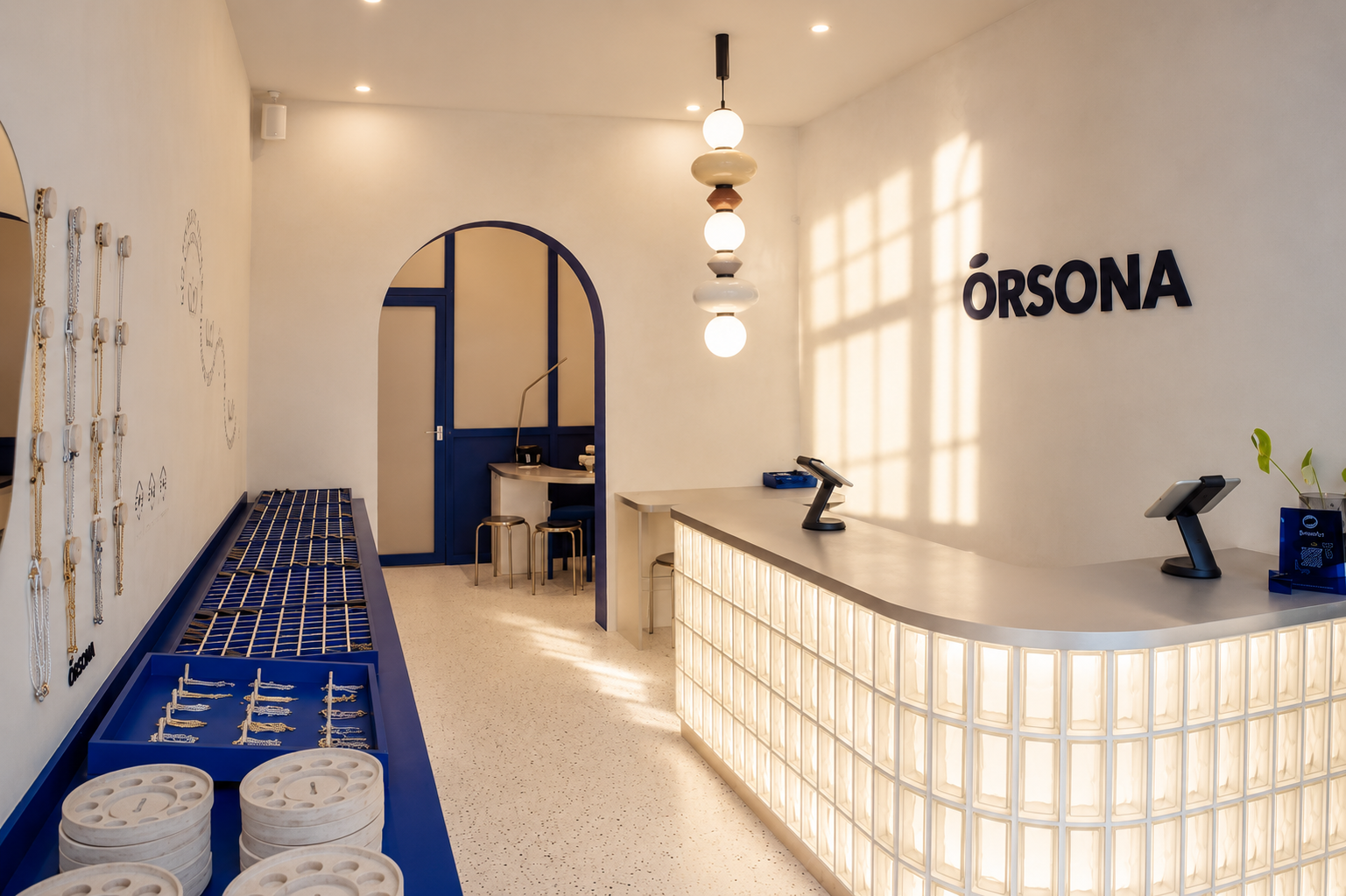
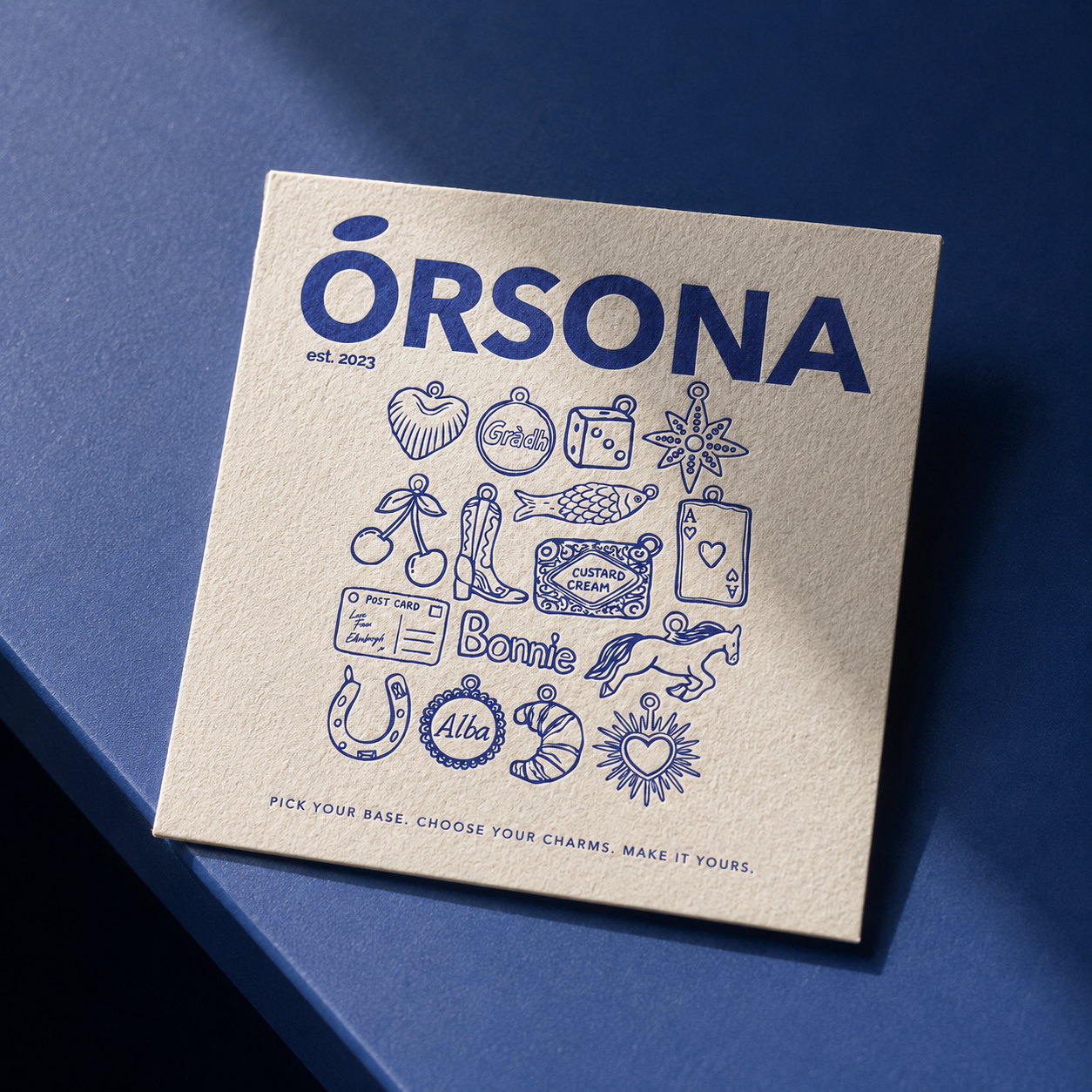
Orsona’s identity had two jobs: look the part and quietly tell people what to do next. We started with illustration.
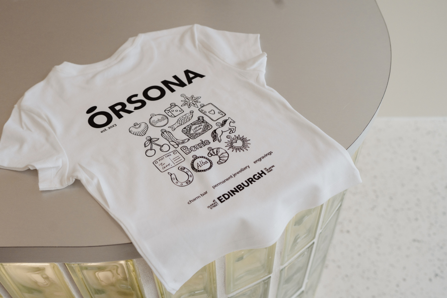
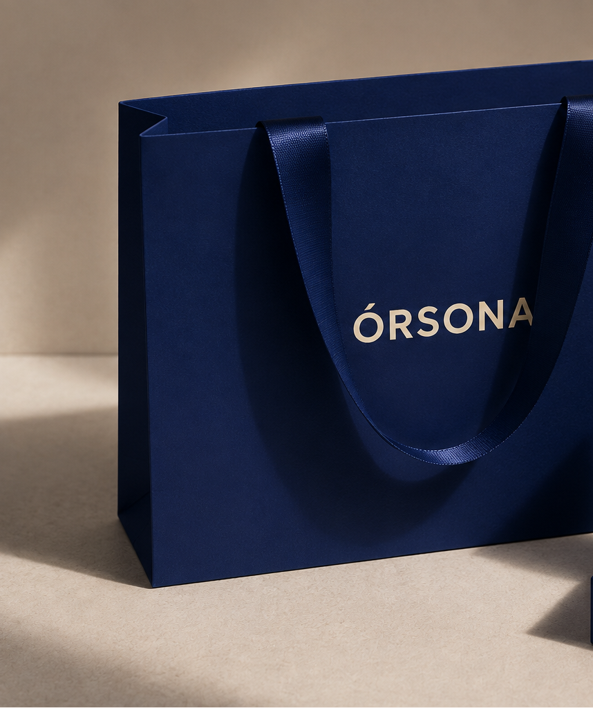
A bespoke library of drawings became the brand’s second language across packaging, the brand suite and staff uniforms. It adds warmth and a little wit, so the bag you leave with feels like a keepsake rather than a wrapper.
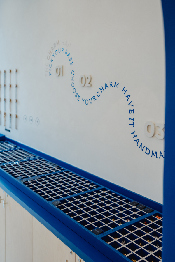
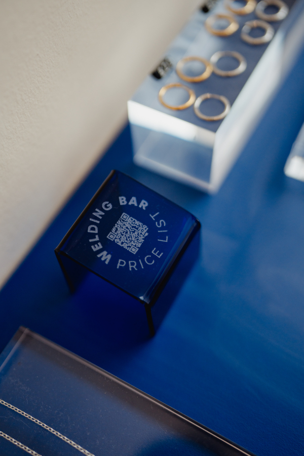
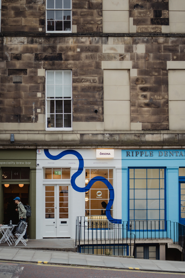
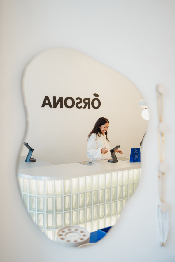
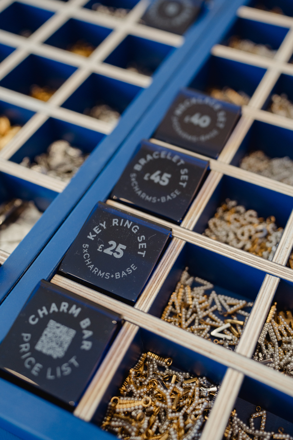
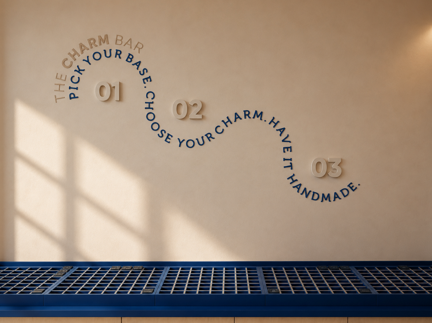
In the shop, the same drawings answer the first question in a room of hundreds of charms: where do I start? Signage and point-of-sale guide people from browsing to making without a word from the staff.
Pretty enough to keep. Clear enough to follow.